Have you ever paused to consider why you gravitate toward certain colors? Or why a particular shade makes you feel something immediate and deep? Whether we realize it or not, color plays a powerful role in our daily lives. From the branding in advertisements to the hues you choose for your bedroom walls, color influences our mood, perception, and behavior. Color, though, does more than sell products or brighten a room. Color is also a way we connect to others when words aren’t enough.
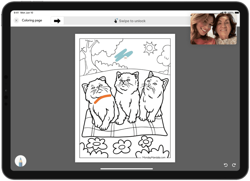
Meet Colorchase, a digital platform that turns color into a language of its own. Designed for emotional expression and connection, Colorchase allows users to draw, create, and share feelings through color when words aren’t an option. Real-time video calling makes it possible to draw together across distances, while memory archiving tools create a digital scrapbook of color-coded moments and emotions. At its heart, Colorchase is about connection. Especially for those experiencing cognitive shifts due to dementia, brain injury, or other conditions. Color can become the bridge to a new way to express what can no longer be said out loud.
At Counterpart, we believe great technology starts with design. It is not about just how it looks, but how it feels to use. We are a design-first company, which means we prioritize intuitive, inclusive, and emotionally aware user experiences from day one. In building Colorchase, we centered the needs of users navigating memory loss, communication barriers, and emotional complexity. Every interaction was thoughtfully crafted to feel simple, supportive, and human. Design should never be a barrier to connection.
Color is more than just decoration. It’s a way to communicate, connect, and remember. Color is one of the fastest ways we interpret our world. Red increases heart rate and urgency. Blue brings calm and focus. Yellow sparks creativity. Have you ever noticed that fast food chains love red and yellow? It’s no accident. Those colors make us hungry and happy. Apple, on the other hand, sticks to muted tones and sleek minimalism to signal luxury and focus. Color choices aren’t random; they’re strategic, emotional, and deeply personal. But color isn’t universal. Its meaning shifts depending on where you are. In the U.S., red means stop, while in China, it symbolizes luck. White is for weddings in the West and funerals in parts of India. So what happens when we start to design with these layers of meaning in mind? We can create experiences that are more human, more thoughtful, and more inclusive.
The same power used in advertisements can be used to soothe and heal. From digital coloring books to therapeutic design tools, color becomes a playful, expressive outlet for people of all ages. This is especially true in moments of stress, grief, or cognitive change. The simple act of coloring can provide clarity and comfort.
Color is everywhere, and it’s saying more than we think. When we start to treat it as something to not just look at, but as a language, the possibilities for connection, creativity, and care are endless. Whether you’re a designer, a caregiver, or someone looking for new ways to connect, Colorchase is a reminder that sometimes, the best conversations don’t use words at all.
Want to see how thoughtful design drives everything we build? Explore our approach to user experience and design first development.
Posted in Clients, Software Services